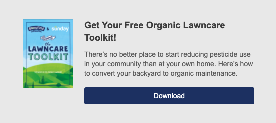
Gone are the days of annoying and intrusive pop-ups thanks to HubSpot’s intuitive and engaging designs. Pop-ups serve as a win-win for both you and your potential customers, as long as they’re done correctly. These forms allow visitors to easily fill out some basic information in order to get the product, document, or e-book they’re looking for, and lets you start building a nurturing relationship with this possible lead.
With HubSpot pop-ups, you can pick where and when you want them to trigger on your website. Some of the most common are:
- Exit intent
- Timing
- Location on page
But as is with most lead-generating inbound marketing strategies, balance is key. Too few pop-ups might lead to a missed opportunity while too many might cause your anonymous site visitor to click out completely.
Table of contents
So what are the best practices? Let’s dive in.
Best practices for using pop-ups
There are three different types of pop-ups that you can use, allowing you to pick the option that best fits your campaign:
- Pop up
- Banner
- Left or right lower box
No matter which one you choose, here is some sage advice to consider when it comes time to design your HubSpot pop-up.
Clear calls to action with an irresistible incentive
Pop-ups can be a make-or-break opportunity when building trust with potential leads, so make sure you have a clear and concise CTA. Visitors should know exactly what they’re getting in return for giving you their information, whether that be an e-book, a discount code, consultation, or other content offer. Additionally, make sure you use actionable language like “Join us” or “Keep in Touch” as a way to engage and inspire visitors.

Design and location
Your pop-up should have an eye-catching design that makes your CTA prominent. HubSpot allows you to customize your pop-ups, so make sure you’re choosing colors and designs that compliment your entire website. Most importantly, make targeted campaigns for desktop and mobile (the latter of which we’ve shared the best practices for on our blog). This ensures that you’re meeting customers where they are and not losing them to a less-than-optimal experience.
Timing
Timing can be everything, so make sure your HubSpot pop-ups are coming in when it’s most applicable to “the moment.” One method you can use is building an exit-intent pop-up to capture visitors before they leave your site. These will appear in the middle of the screen and offer one final value offer to entice them to stay. You can also set them to trigger after a certain amount of time has elapsed. If someone has already been on your site for 20 to 30 seconds, for example, chances are they’re already interested in your site.

Say thank you
This simple step can make an automated process seem a little more personal. This is also a great opportunity to let your lead know about the next steps, like who they can contact if they have questions, or about similar offers or programs they may be interested in.
Other strategies to keep in mind:
- Use A/B or split testing for every pop-up campaign to see what’s most successful.
- Choose your offers carefully so visitors will want to come back to your site or use your services further.
- Make it easy to exit the pop-up.
- Don’t ask for too much information at first.
- Set up email alerts so you always know when a new lead comes in.
- Create a follow-up email to help nurture leads. This can be done through the marketing automation tools within your HubSpot account.
Tips and tricks for building HubSpot pop-ups
Once you’ve built your pop-up, you can customize when it’s triggered on your site. This targeted approach provides a seamless user experience and will help convert more leads into deals.
Website URL or query targeting
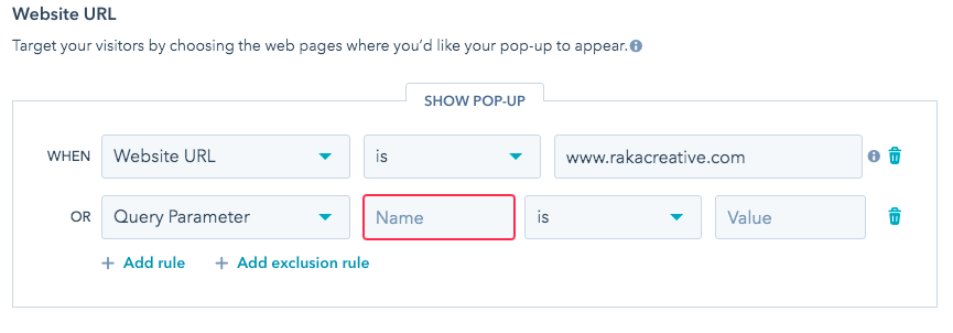
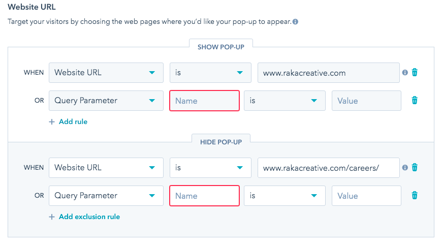
Tie your pop-up to a specific URL or targeted queries on your website. That way, you can have an e-book pop-up CTA only show up on your e-book page and not your “Careers” section. This is a great option too if you have multiple pop-ups you want to set up throughout your site. By default, pop-ups will appear on all your pages unless otherwise specified.
To set this up:
- Under the “Targeting” tab of your pop-up builder, you will see a box for Website URLs. From there, you can set the values of your specific parameters.

Exclusion rule
For both, you will be able to add exclusion rules. This means you can keep the pop-up from appearing on specific pages on your site, even if it falls within the parameters you set.
Tip: If you create a URL targeting rule using the homepage domain, it will show up on all pages and overwrite any pop-ups you create for specific pages. When trying to add a pop-up to only the homepage, you will need to suppress all lower page folders on the homepage pop-up target. Additionally, you will need to suppress the homepage for all other interior pop-up forms.

Using HubSpot pop-ups is a great way to start turning your anonymous traffic into leads by creating custom offers using personalized designs. This inbound marketing tool is just another way you can use your HubSpot account to generate more leads and meet your strategic goals.


